Blue Santa
Blue Santa is a nonprofit organization based in Lago Vista that gives back to families during the holiday season through food drives, toy donations, and community support. Our team was asked to redesign their website and create supporting deliverables that felt more welcoming, organized, and easy for the community to navigate. The goal of this project was to create a clean and approachable experience that reflected the caring mission behind Blue Santa while improving overall usability and visual consistency.
Original Deliverables


The original website and postcard designs contained a large amount of information, inconsistent layouts, and imagery that lacked visual organization. While reviewing the original materials, I focused on understanding what could be improved through spacing, typography, hierarchy, and overall structure. This helped guide the redesign process and allowed us to create a more cohesive and user-friendly visual identity for the organization.
Post Card
Mood Board/ Drafts


For the postcard redesign, I created mood boards and early draft concepts to explore different layouts, typography styles, imagery, and color direction. This stage helped establish the overall visual tone of the deliverable while allowing me to test spacing, alignment, and composition before moving into the final design process.
Low- Fidelity Wireframes
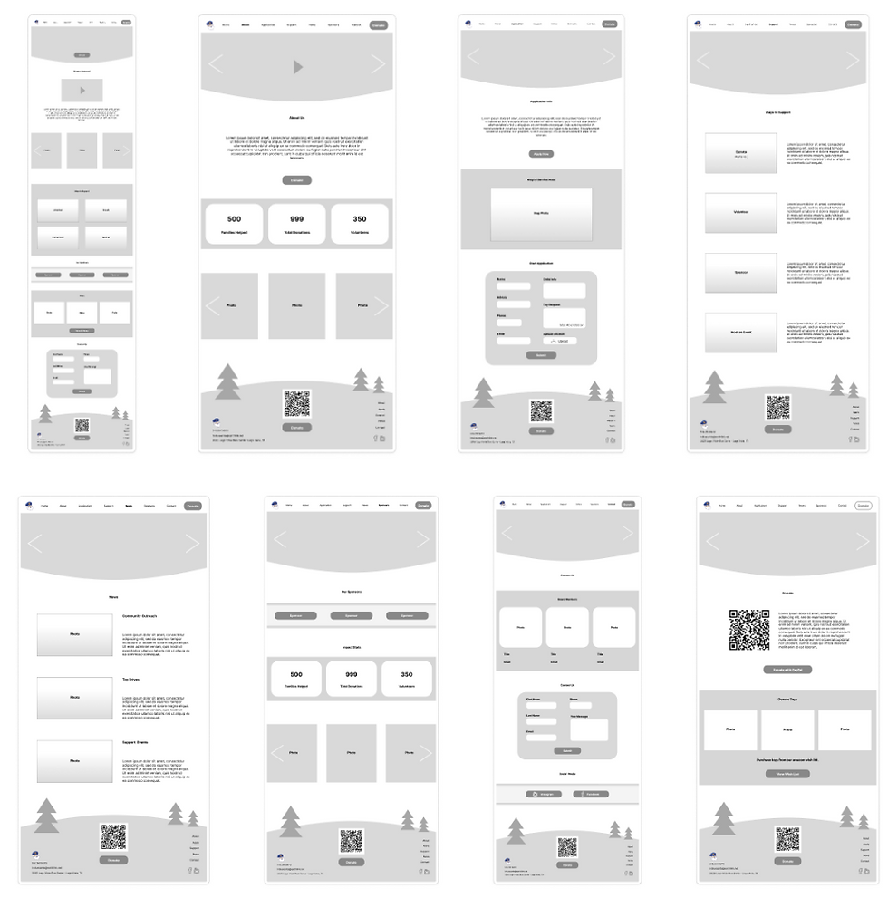
The low-fidelity wireframes helped map out the structure of the website and organize where all text, imagery, buttons, and navigation elements would be placed. This stage focused on creating a clear and functional layout before adding visual styling, helping us establish the foundation for each page throughout the website.
Mid- Fidelity Wireframes


During the mid-fidelity stage, we developed multiple website variations and presented them to our client for feedback. This process allowed us to refine layouts, improve visual balance, and better understand the direction the client connected with most. After reviewing feedback together, Version 4 became the final direction that guided the rest of the project.
High- Fidelity Wireframes

The high-fidelity wireframes brought the full visual direction of the website to life. At this stage, I designed finalized layouts with imagery, typography, buttons, QR codes, links, and organization for each page. Working as a two-person team, we divided the website pages evenly while maintaining a cohesive visual system across the entire project.
Final Design


The final Blue Santa website was fully designed for both desktop and mobile platforms to create an accessible and responsive experience for users. Along with the website redesign, I also completed the final postcard deliverable to support the organization’s outreach and donation efforts. The final result feels clean, welcoming, and reflective of Blue Santa’s mission to support the community during the holiday season.
Reflection
This project was an incredibly rewarding experience and helped me grow both creatively and professionally. At the beginning of the process, I wasn’t sure what a full client project on a two-person team would look like, but by the end, I was proud of how much we accomplished together. It pushed me to strengthen my skills in web design, collaboration, and organization, while also showing me how impactful thoughtful design can be for a real community organization. The small logo icon at the bottom of the page acts as a clickable link that takes users directly to the live website.
