Florence
Florence is a city rebranding project inspired by the beauty, history, and artistic culture of Florence, Italy. The goal of this project was to capture the warmth and elegance of the city through branding, typography, and visual storytelling. While researching Florence, I explored the city’s architecture, Renaissance art, flowers, and historical symbolism, which inspired the custom symbol I created and applied throughout the brand identity.


Mood Boards
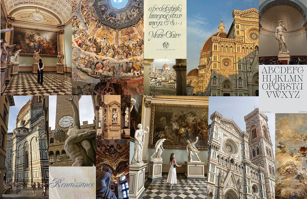
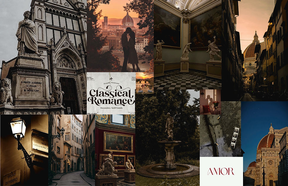
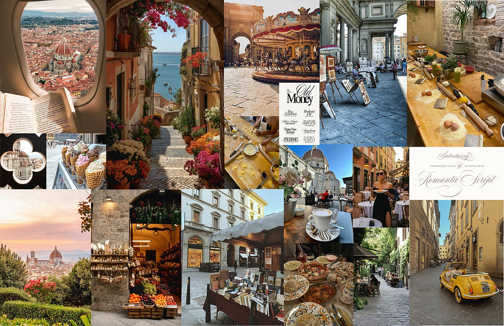
The mood boards helped explore multiple visual directions for the Florence brand. I experimented with romantic and elegant visuals, darker luxury-inspired aesthetics, and brighter lifestyle imagery to better understand the personality of the city. This stage helped establish the warm, artistic, and timeless feeling that guided the overall design direction.
Sketches

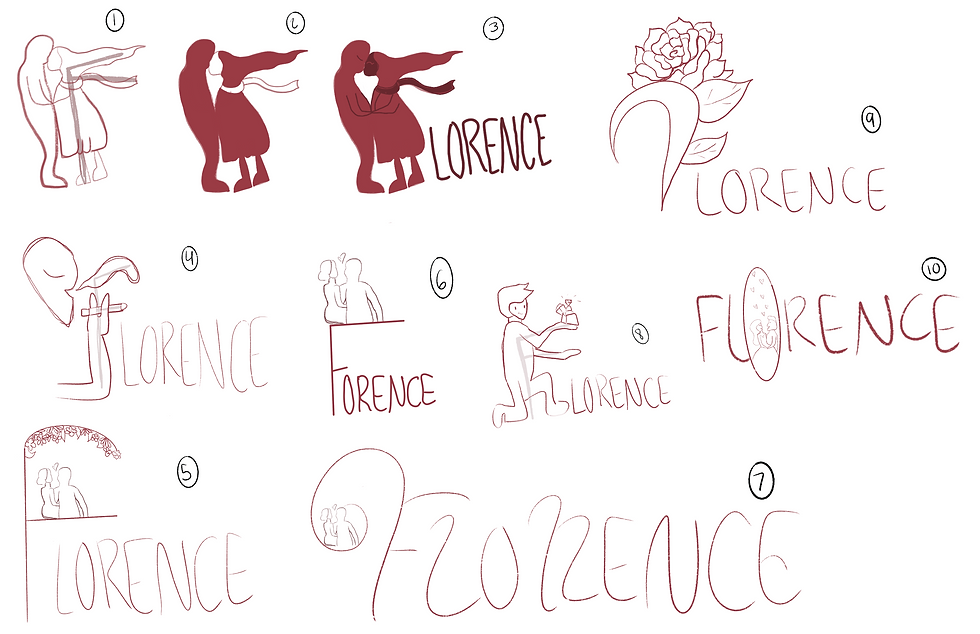
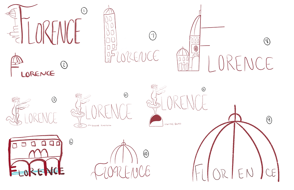
During the sketching phase, I explored a variety of logo concepts, typography styles, and symbol ideas inspired by Florence itself. I experimented with replacing letterforms, incorporating decorative elements, and testing different visual combinations to discover a direction that felt elegant, artistic, and connected to the city’s identity.
Digital Drafts


The digital drafting process focused on refining my strongest logo concepts and experimenting with typography and composition inside Illustrator. While developing the brand, I knew I wanted the “F” to become a strong visual element within the identity, so I explored multiple layouts and styles before narrowing down the final direction.
Digital Drafts 2
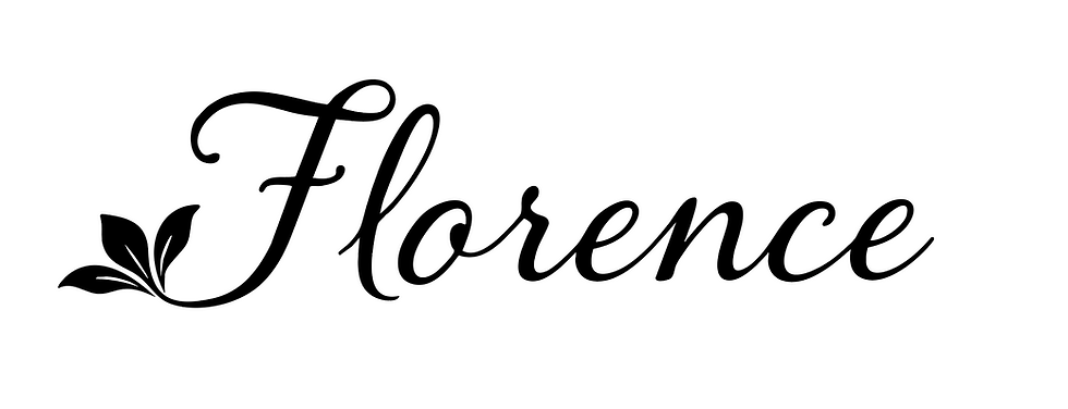

As I continued refining the branding, I narrowed the project down to two final logo directions — one more decorative and scripted, and the other more bold and structured for branding applications. After comparing both concepts across mockups and layouts, I chose the stronger and more versatile direction to move forward with for the final identity system.
Final Design


The final Florence branding combines elegant typography, warm red tones, and custom visual elements inspired by the city’s art, architecture, and culture. The phrase “Where Art Breathes” was created to reflect Florence’s deep connection to Renaissance art and creativity. Through posters, packaging, website mockups, icons, and other deliverables, the final design creates a cohesive identity that feels romantic, timeless, and inspired by the atmosphere of Florence, Italy.
Reflection
This project was such a fun and rewarding creative experience because it allowed me to explore city branding in a more artistic and research-focused way. Learning more about Florence’s culture, history, and visual identity helped guide many of my design decisions throughout the project. Overall, it strengthened my branding and research skills while allowing me to create detailed mockups and a visual identity system that felt cohesive, elegant, and meaningful.