Holi Poster
This project focused on creating a typography-based event poster inspired by Holi, the Festival of Colors celebrated in India. Holi is known for its bright colored powders, music, celebration, and joyful atmosphere that brings people together. The goal of this project was to create a bold and visually engaging poster using typography while capturing the energetic and colorful feeling of the festival.


Mood Boards


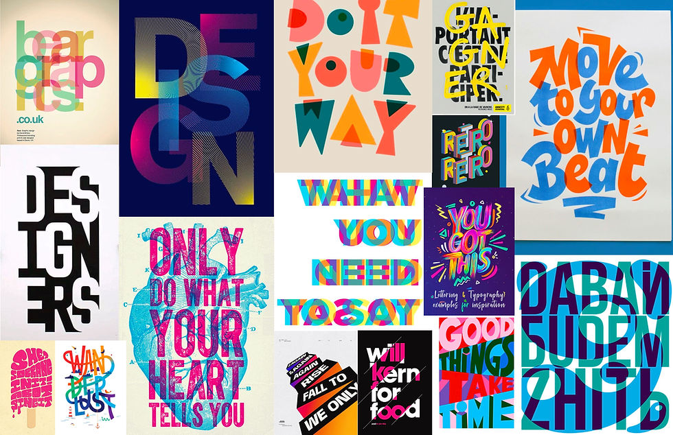
The mood boards helped explore different visual directions for the project, ranging from bold maximalist styles to more structured and graphic layouts. I focused heavily on color, movement, typography, and powder-inspired visuals to better understand how to capture the excitement and energy of the Holi festival through design.
Sketches
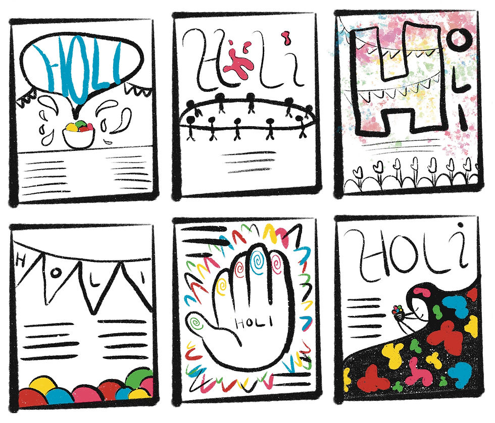

During the sketching phase, I experimented with multiple layout ideas, typography styles, and supporting graphics for the poster. I wanted the concepts to feel playful, expressive, and visually exciting while still remaining readable and balanced. This stage allowed me to quickly test ideas before moving into digital designs.
Digital Drafts

The digital drafting process focused on refining my strongest concepts and experimenting with different typography arrangements, color combinations, and logo ideas. One of my earlier concepts included a hand symbol as the “O,” but after testing it against different backgrounds, I realized it needed a stronger visual solution. This stage helped me refine the design into something more cohesive and visually impactful.
Digital Drafts 2
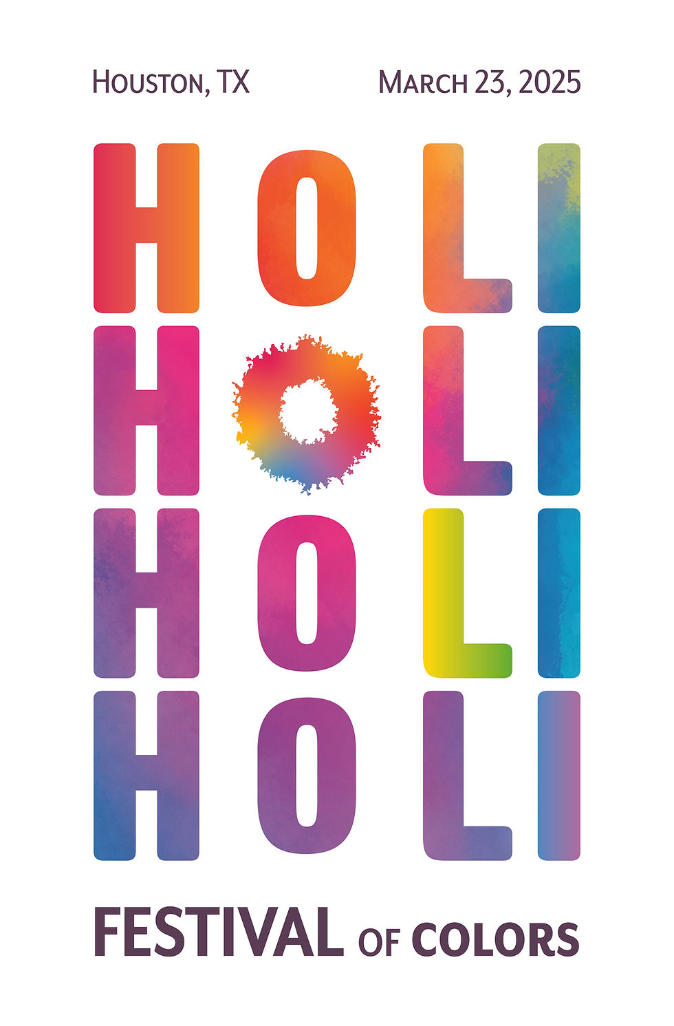

As I continued refining the poster, I explored black-and-white and color variations to better understand contrast, hierarchy, and composition. While the typography-focused direction worked well, I wanted the poster to feel more immersive and energetic, which eventually led to incorporating additional visual elements into the final design.
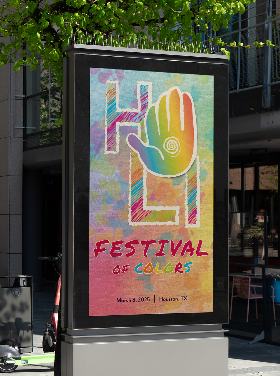
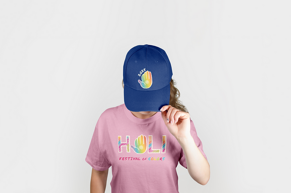
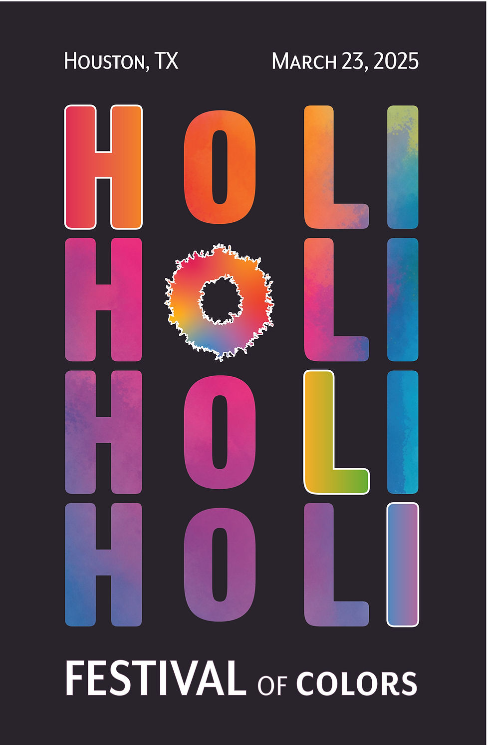
Final Design


The final Holi poster combines bold typography with colorful powder burst imagery inspired directly by the festival itself. The “O” within the logo became part of the powder burst visual system, helping create consistency and unity throughout the posters and supporting mockups. The final result feels energetic, vibrant, and expressive while still maintaining a clean and cohesive event identity.
Reflection
This project became one of my favorite creative challenges because it pushed me to continue refining my work even when I wasn’t fully happy with the first direction. After receiving feedback from my classmates and professor, I was able to rethink the design and turn it into something much stronger and more visually exciting. Watching the project evolve from a simple typography poster into a full event branding concept was incredibly rewarding and satisfying to create.